This time we delve a bit deep into the Science of Box Art, so lets get started 🙂
From the day we’re born to the day we die, everyone always tells us, “Don’t judge a book by its cover.” Well, tough. I’m going to judge because who the hell has time to read that shit anymore? But when it comes to dropping $60 on a brand new game, bad box art can send up all kinds of red flags.

In this case, they all scream “pedo”.
In the days before gaming mags, review websites and my brother(Hi Adi! I’m out of the pit. And I’m coming for you) a kickass box art was all that we had to go on while spending hard earned cash on the latest brain-fart by our second favourite publisher.
But times have changed since then. We now have Wi-Fi and streaming porn and canned cheeseburgers. Yet in the decades since the Mario movie, it seems the only constant is publishers handing a bottle of whisky and some crayons to an intern the night before release and hoping for the best.
Here’s a comparison of some box art to prove my point, divided per genre into rubbish and brilliant:
(Also, a note for you pedantic twats/fanboys out there. I’m judging the cover art, not the game within.)
War Games:
Rubbish: Battlefield Bad Company 2

The above specimen depicts what I can only describe as a child’s army men figure set run through a black-and-white filter. And several layers of shit.
There’s literally no action worth the name and the scowling dude with a gun is walking up to us in a way that says, “I have a stick jammed so far up my ass that it paralysed my facial nerves. Where’s the nearest port-a-potty?” If it got any more dark and gloomy Tim Burton would sue.
Also, is he the Human Torch?
Brilliant: Battlefield Bad Company

Yes, war is hell. But, by God, at least try to have a little fun! Have a look at the playful juxtaposition of disarming cuteness and high-explosive death. The game doesn’t take itself too seriously and is all the better for it.
And in the background we have four silhouettes, the titular “Bad Company”, and you can just tell they’re either about to start, finish or explode a fantastical journey through whatever is/was their target. All they’re missing is a van.
Within one sequel, DICE managed to destroy colour, cuteness and friendship. When your resume puts Disney villains to shame, you may have forgotten that you’re in the Fun business.
Superhero Games:
Rubbish: X-Men Origins Wolverine

That steely gaze. That rugged beard. Those glinting knives coming out of higrhrewyegfewyf….. Sorry, must have nodded off there out of the sheer tedium of looking at this cover.
This cover is utter proof that everyone in art school deserves a full refund. The hero is a death-proof Canadian slaughter machine with unbreakable knives coming out of his freaking hands! That’s my every dream, ambition and sexual fantasy all at once.
And all they give me to look at is a mildly constipated Hugh Jackman.
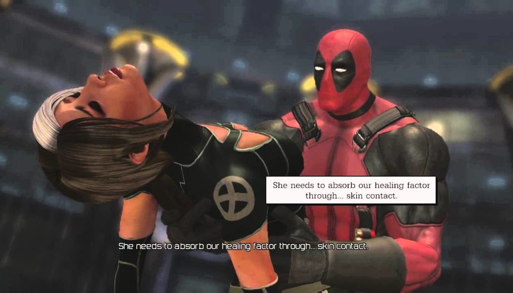
Brilliant: Deadpool

Now this is how you sell a game people. Not being a shitty tie-in to a movie helps but I like to think that Marvel stopped doing coke for just enough time to oversee this.
Deadpool himself stands tall above his contemporaries fixing us with his almost “Old Spice Guy” calibre look. And below is a selection of X-Babes caught in an explosion made of money. Throw in ‘Pool’s old sparring partner Cable for some nerd cred and BAM! Instant classic.
There is absolutely nothing wrong with….
Wait, is Wolverine still constipated?
Zombie Games:
Rubbish: Dead Space 3

As if to complete the transformation from horror to action, the cover art started with torn off limbs, shifted to a mug shot of Isaac’s mask and finally ended with the classic “Non-descript man with gun”.
Never before or since has a series worn its heart so on its sleeve. It’s almost cute, as if Visceral is desperately screaming,” EA ruined everything about this game. Please don’t buy this. Let the series die before we’re forced to add Killstreaks and air-strikes. Oh no here they come again! Nooooo!”
Also, what’s with all the white? We know the game is set on the ice planet (how original) but you don’t need to blind me with the fact. My pet theory is that some of the coke stash got jammed in the copier that week and no-one noticed till release day. Tell me that doesn’t make sense.
Brilliant: Dead Rising

Up there is everything gone horribly right in the modern era. Trapped in a temple of capitalism, an everyman takes on the brainless horde with the very symbol of stupidity with an explosion in the background. And he is undoubtedly winning.
When you design a cover for a zombie game, what do you put on the cover? Zombies right? WRONG. You show zombies being obliterated in the most entertaining way possible. Frank West knows this.
He’s the perfect video game hero simply because he’s read our mind perfectly. When he heard the horde approach, all he did was tighten his belt, crack his knuckles and unleash his murder boner with Reality TV.
Reblogged from : Gamers Soapbox